
Software Engineer
How to build a chatbot for your website? Part 2: Frontend Design
Introduction
Welcome to Part 2 of my article series, "How to build a chatbot for your website?". In this part, I’ll delve into my methodology for constructing the visual components of the chatbot feature, including the chat window, buttons, textboxes, and any associated graphics. My articles primarily aim to share my thought process rather than instruct on coding. Furthermore, my discussion is confined to a single feature, not an entire web application. The source code for this article can be found in my Git repository.
Frontend Design Requirements for the Chatbot
Drawing inspiration from numerous live chat windows available on the internet, I’ve identified the following key features. Please note, this list is not exhaustive:
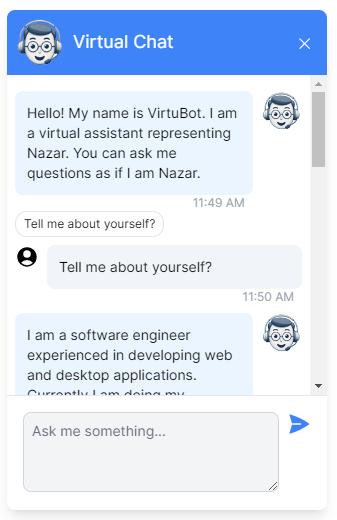
- The chat window is positioned at the bottom right of the page.
- A small button is present that toggles the chat window between maximized and minimized states. When the button is visible, the chat window is hidden, and vice versa.
- The chat window comprises three primary sections: the header, the conversation box, and the message box.
- The header section displays the title and an image of the bot.
- The conversation box contains the messages exchanged between the visitor and the bot.
- The message box provides a text area where visitors can type and submit their questions.
Specifically, for the conversation component, I envisioned the following features:
- Each message is visually distinct in terms of alignment and style. This means that the bot’s messages appear on the right, while the visitor’s questions are displayed on the left.
- Every message is accompanied by a small image that signifies whether it’s from the visitor or the bot.
- A timestamp is provided beneath each message.
- A clickable suggested question from the chatbot is displayed beneath the response to the visitor’s question. This suggested question is visually distinct from the main response. When clicked, it is automatically transferred to the question box and submitted on behalf of the visitor.
- When the bot is processing a response, an animated sequence of three dots indicates the “loading” state of the server’s response.
Additionally, I wanted to incorporate a popular feature often seen in chatbots, where the response appears incrementally, mimicking the effect of being typed on a typewriter. This feature has also been added and will be discussed in Part 3.
How to style the chat window?
My website is already constructed using Tailwind CSS. Consequently, I decided to stick with this choice and utilized the Tailwind CSS framework to style the chat component. However, I can share my thoughts on selecting a framework.
A brief theoretical discussion is inevitable at this point. CSS, or Cascading Style Sheets, is a stylesheet language that determines the presentation of a document written in HTML or XML. It governs how elements are displayed on various media, such as screens, paper, or speech. It is the 2138th best thing that happened to humanity after HTML. With CSS you can write instructions like below to set color and font-family for texts in paragraphs.
<style>
p {
    color: green;
    font-family: Verdana, sans-serif;
    font-size: 20px;
}
</style>
<body>
<p>This is a green text in Verdana font.</p>
</body>
CSS enables the segregation of visual styling from your page’s structure. It’s the technology that facilitates theming based on user preferences. It’s the driving force behind the ability to switch between Dark (Night) and Light (Day) themes in numerous user interfaces.
CSS is an advanced piece of technology invented in 1994, by Norwegian technologist Håkon Wium Lie, and developed further by Lie and Dutch programmer Bert Bos. I am always inspired by people who are behind these amazing web technologies.
As you can see, CSS has a easy-to-grasp yet sophisticated syntax. We can style our pages with plain CSS. In the computer world, plain things are often referred to as "vanilla." However, in this case, we can't use that term because there is an actual Vanilla CSS framework.
Writing thousands of CSS instructions manually can be time-consuming, error-prone, and tedious. To address this, CSS frameworks have been invented. CSS frameworks provide high-level instructions that are converted into plain CSS rules by the browser. For example, instead of defining a paragraph element with specific styles, we can create shortcuts like 'green' and 'verdana' to visually change elements wherever these shortcuts are used.
<style>
.green {
    color: green;
}

.verdana {
    font-family: Verdana, sans-serif;
}
</style>
<body>
<h1 class="green verdana">This is also green and in Verdana</h1>
<p class="green verdana">This is a green text in Verdana font.</p>
</body>
These are simplistic examples, but imagine thousands of useful shortcuts like these. CSS itself is a shortcut, and CSS frameworks add another layer of shortcuts, making you even more efficient.
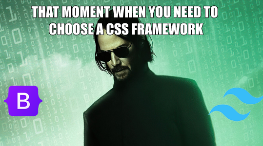
Which CSS framework to use?
There are many CSS frameworks on the World Wide Web, but the most popular ones are Bootstrap and Tailwind. Bootstrap was developed at Twitter and released as an open-source project in 2011. Tailwind, created by Adam Wathan, was introduced in 2017.
The main difference between these frameworks is their approach. Bootstrap is built around the concept of components such as buttons, navbars, modals, and dropdowns. For example, if you apply the class "btn" to an element, it will be styled visually as a button. Tailwind, on the other hand, is based on a utility-first approach. Instead of creating components, each class in Tailwind is designed to achieve one specific style, such as color, font weight, or alignment.
Background picture source (C) goodfon.com
Both frameworks have their pros and cons, and the differences between them shouldn't be exaggerated. If we look carefully, Bootstrap also includes some utility classes, and there are Tailwind components built using utility classes because, at the end of the day, web developers need to build components.
Both frameworks are equally powerful, with large communities and extensive knowledge bases. I can imagine using Bootstrap for one project and Tailwind for another. With proper use, similar visual styling can be achieved with plain CSS, Bootstrap, or Tailwind. It all depends on which framework you feel most comfortable and fluent with. If the architecture of your web application is well-designed, it's unlikely that either Bootstrap or Tailwind will become a bottleneck. CSS files are downloaded separately by your browser and are cached.
Returning to my preference, I chose Tailwind because the default styling used in its documentation is visually more appealing, featuring a sleek, modern, minimalist look. The way Tailwind combines colors, shadows, rounded borders, margins, and padding demonstrates good design taste. While I could achieve the same beautiful design with Bootstrap, Tailwind is already tailored to this style.
Some people find that they have to write many Tailwind classes for a single HTML element. However, we now build web applications with frameworks like Angular and React, where everything is a component. This means we don’t have to write combinations of Tailwind classes everywhere; we write them once and reuse the components. Additionally, if we want to create shortcuts for combinations of Tailwind classes, the framework is highly customizable and allows us to create new classes using plain CSS and Tailwind utility classes.
Where to find images and icons?
Chatbot image: To create the bot icon, I utilized the AI prompt: "Create a chatbot icon for a live chat system with a friendly human-like face. Include a headset or glasses for the human touch. Make background color white." From the options generated, I selected one that best satisfied these elements.
Icons: for the Close icon and Send icon I used Heroicons and searched for the keywords "close" and "send". I used SVG formats. For the chat bubble button I used free SVG image sharing websites.
Generally, for design elements, I prefer to incorporate vector graphics into my projects whenever possible. This is because they are easier to resize and restyle without the need for image editors.
HTML structure and CSS styles
When developing a large application or collaborating with a multi-member team, one might consider designing wireframes using a tool like Figma. However, in this instance, as I was working on a relatively small feature within a single-member development environment, I did not utilize any external UI design tools. For a more complex project, I would definitely use Figma.
An AI prompt such as "Create a chatbot window and styles in HTML and Tailwind CSS that appears bottom right of a webpage." can be used to create the initial skeleton. However, to achieve the final results, additional work will be required. Familiarity with Tailwind and CSS syntax in general is beneficial for gaining granular control. I kept the Tailwind CSS documentation open and consulted Copilot for any clarifications I needed.
The most important classes and rules I used are:
- fixed - position the chat window relative to the browser window.
- bottom-4 - align the chat window to the bottom of the page. Here 4 indicates a 16px margin. Other values are possible.
- right-4 - align the chat window to the right side of the page. Here 4 indicates a 16px margin.
- z-10 - put the chat window minimized bubble in front of the main window.
- p-* and m-* - p classes are for padding and m classes are for margins. Choosing good values is a matter of personal taste. It is a good idea to put some space between box borders and text.
- @keyframes - I used this CSS rule to to animate the three loading dots. You can look at the code, I won't discuss it in detail here, as it is a relatively advanced feature of CSS.
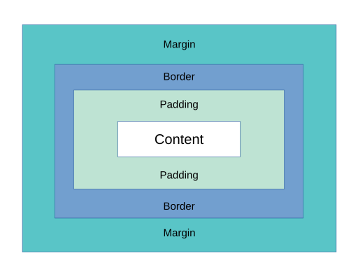
To understand the concepts of border, margin, and padding, look at Figure 2. For this design I used CSS flexbox layout. If you are interested in more complex layouts, you need to understand CSS grid layout and CSS flexbox layout well and apply accordingly. Getting the layout right is one of the hardest things for novice CSS users. One thing that helps me is until I get everything in place, I set border on elements to see where element blocks begin and end. You can use this simple tip until you get proficient in layouts.
You can observe how all classes and styles work together in the source code for this article in my Git repository. Although the bubble and chat window appear overlapped here, they do not appear together in the actual application.
The Tailwind library is imported with the <script src="https://cdn.tailwindcss.com"></script> tag on the page. While this method is acceptable, the real application imports it differently, allowing for more granular customization of Tailwind.
This structure is barebones and does not include any Angular features. In a real application, it will have additional elements that connect to the web application system, which will be discussed in Part 3.
Visual thinking as a method of motivating yourself
Even a small feature like this chatbot has a lot of moving parts. You need exposure to HTML, JavaScript, CSS, and SVG, each with its own nuances that you discover through hands-on experience. Creating a visual window like this is an achievement, and succeeding in it will motivate you to take the next step. The main idea is to minimize abstract thinking and convert ideas into visual elements as soon as possible. Your brain is like computer memory—you need to create space for new tasks instead of trying to think about everything all at once.
Key takeaways
In conclusion, here are my key recommendations for the Frontend Design phase:
- Write the requirements for your frontend design and study good practices on the web.
- Adopt an incremental approach; the feature you are developing does not have to be perfect in the first version.
- Boost your productivity by using an established CSS framework, such as Bootstrap or Tailwind.
- Read and understand CSS box model, CSS grid and flexible box layout models.
- To increase your development speed, use a simple HTML webpage to quickly test your ideas.
- Utilize AI to create skeletons and refine them using the official documentation as your reference.
Now that we have our visual elements in place, we are ready to proceed with frontend coding. See you in Part 3.
- #chatbot
- #frontend
- #design
- #css
- #tailwindcss
Hello! How can I help you today?
 AI Chat
- Hello! I am an AI chat assistant representing Nazar. You can ask me questions as if I am Nazar.2:09 AMTell me about yourself?